Capital One Spring Sign Up Conversions
Homepage exploration and testing yeilds results
Overview
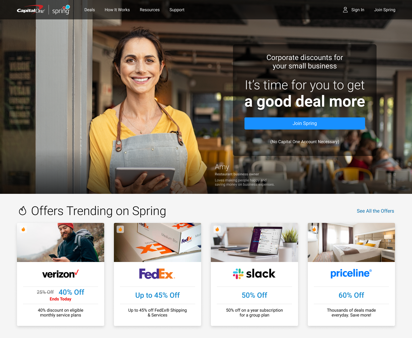
Spring from Capital One is a site dedicated to bringing discounts on goods and services to small businesses.
Spring is a free service but requires visitors to sign up and log in before a discount code or link is revealed. Existing Capital One customers by default have access to Spring as they can log in using their Capital One online credentials.
Given a site or application which compiles discounts isn't unique in itself, Spring is different in that a deals team at Capital One negotiates discounts which are often better than those found elsewhere.
The Problem
Spring's bounce rate for the homepage was an astronomical 97%. A bounce rate this high isn't even considered acceptable for blogs or news where users often go for one specific reason and leave.
The Objectives
Given the high bounce rate, we needed to address the following objectives:
- Decrease the bounce rate
- Improve user comprehension
- Establish a clear and intuitive next step
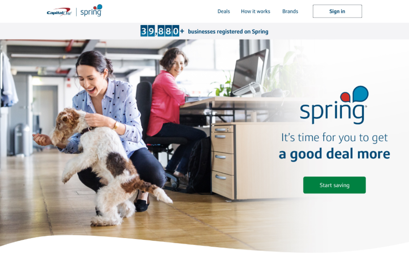
Spring soft launched in 2017 but it's formal national launch won't be in late 2020. What copy tells the user what the purpose of Spring is? Where are examples that would help reinforce the purpose? These are a few pain points that needed to be addressed.
The Process
The process started with a UX audit of the entire site. While this is certainly looking at more than the single page in question, I was new to Spring and I needed to understand the site as a whole to deliver relevant insights that could potentially be carried through out the application.
Audit
For Spring's homepage bounce rate problem the process started with a UX audit of the entire site. While this is certainly looking at more than the single page in question, I was new to Spring and I needed to understand the site as a whole to deliver relevant insights that could potentially be carried through out the application.
The UX audit provided a critique of the homepage, noting mistakes in UX best practices and lack of content to tell the user just what Spring has to offer but just as importantly it also provided key information by defining personas and customer journeys as well as evaluating competitors.
I conducted a complete audit of the Spring product when I first came on board, this helped to better understand the impact a change on one page might have through out the rest of the site.
Research
Our UX researcher and I ran a series of qualitative tests on the homepage to help gauge the users understanding of Spring. It's my belief that a visitor needs to be able to understand what the product has to offer in a concise and compelling way in order to get them to take they next step and drive adoption.
We found visitors were having a difficult time understanding the purpose of Spring. Above the fold there was only catchy and somewhat cryptic marketing blurbs which kept our marketing department happy but wasn't helping users. We followed our initial tests up with a series of bare bones comprehension tests which confirmed the copy of the page wasn't conveying the purpose of the product.
Further more, the main call to action was cryptic as the button label didn't tell the user where they would be taken to. Combining these elements it was easy to empathize with the user's being confused.
Ideation
Sketching
I love the immediacy of sketching, not relying on anything digital, this is truly freeing and can allow ideas to flow fast. Sketching can often involve quite a bit of iterations, again because your not held back by a digital platform. The eraser or a new sheet of paper can be a powerful friend in these situations.
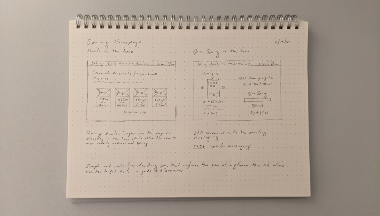
These are only a few sketches for demonstration purposes however it is not unusual to do 2, 3, 4, 5x as many.
Wireframes
We distilled several options down to the 2D, architectural type, representations of the design. I found the main benefit here is allowing the stakeholders to focus on the content and flow. There are no color distractions to get people off topic. After reviewing these it was easy to determine the next step we wanted to take and validate.
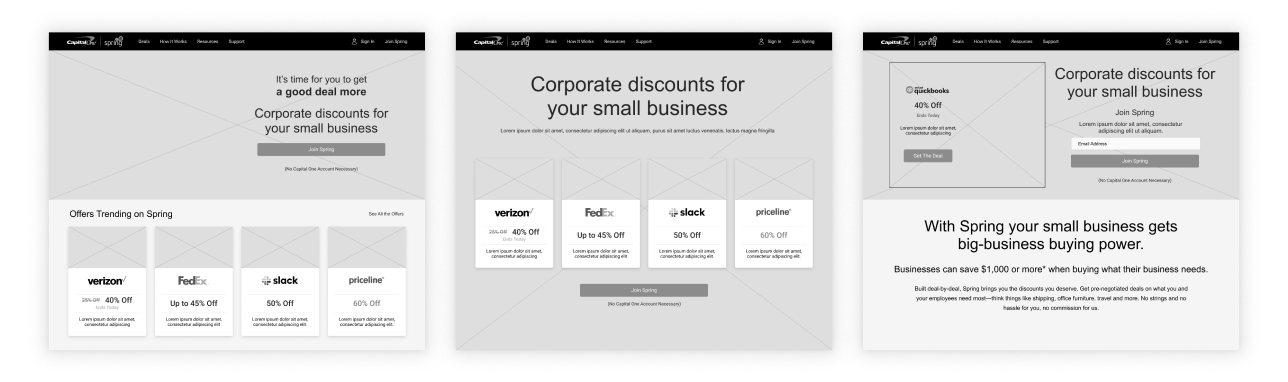
Wireframes serve a vital purpose, the focus from stakeholder and feedback you receive is often extremely helpful.
Design
The mockups I created were done in Figma which allowed me to use the official Capital One design library known as 'Gravity' for basic elements and responsive grids. It was also necessary for us to establish our own separate design library for our product which has UI elements specific to our product. We wanted the product to align with it's siblings yet be distinctive in certain visual treatments and micro interactions.
Using what we learned in the research phase we updated existing and added additional copy to tell the user clearly and directly what Spring has to offer. The call to action, inline with the new copy, had a clear label letting the user know what the next step is.
Aligning to the corporate design system allowed us to leverage the trust that has already been built there by the corporate brand.
High fidelity mockups are reviewed and critiqued by the product experience group yielding additional insights and ideas.
Conclusion
Test, test, then test some more. While we were able to make significant improvements to the bounce rate iterating and A/B testing continues. As a designer once I start working on a problem it is hard to let go and for this project I will continue discovering and testing. It's my belief that data driven design is highly effective and addictive which is the stage we are now in.